Impact360 Alliance Capstone
Project Details
| Course | Other Team Members |
|---|---|
| Capstone (HCDE) | Daniel Kim, Connor Aylor, Jonathan Cole |
Introduction
Our team of four worked with non-profit Impact360 Alliance to address the lack of communication between the research and practitioner communities within the field of hazard management.
Problem Definition
Natural hazard researchers and practitioners often have significant overlap in what their work concerns, but remain isolated in terms of cross-disciplinary communication and information dissemination.
Our task for this project was to design a solution to bridge the gap between these two groups so that researchers’ findings can be applied effectively in the field and practitioners’ most pressing questions can get answers when needed.
The final deliverable was a set of high-fidelity mockups of a web-based platform to be used by both the researchers and practitioners. The project lasted from January to June 2019 and involved stages of research, prototyping, and user testing.
Literature Review
Building off of Impact360’s initial research, we conducted a literature review on areas like designing for trust and knowledge transfer, resulting in a number of insights:
- With greater trust between people, less additional info is required for successful communication.
- Supporting interpersonal relationships between researchers and practitioners is crucial to building lasting trust.
- Experts can work better with each other by acknowledging differences in work cultures.
These findings emphasized the need to help build relationships, both between individual users and the communities at large.
Interviews
Ten semi-structured interviews were conducted to better understand the needs, values, and day-to-day challenges of our two primary stakeholder groups. Our research was driven by the question, “what obstacles are keeping researchers and practitioners from communicating and collaborating effectively?”
Interviewees were asked questions revolving around past interactions with researchers/practitioners, as well as day-to-day responsibilities. Interview data was analyzed using affinity diagramming, resulting in four key findings:
- Online tools for collaboration are currently lacking.
- Practitioners often lack the time and/or technical knowledge to parse research papers for actionable information.
- Finding experts to work with is difficult due to lack of existing channels.
- Both sides seek mutually supportive practices.
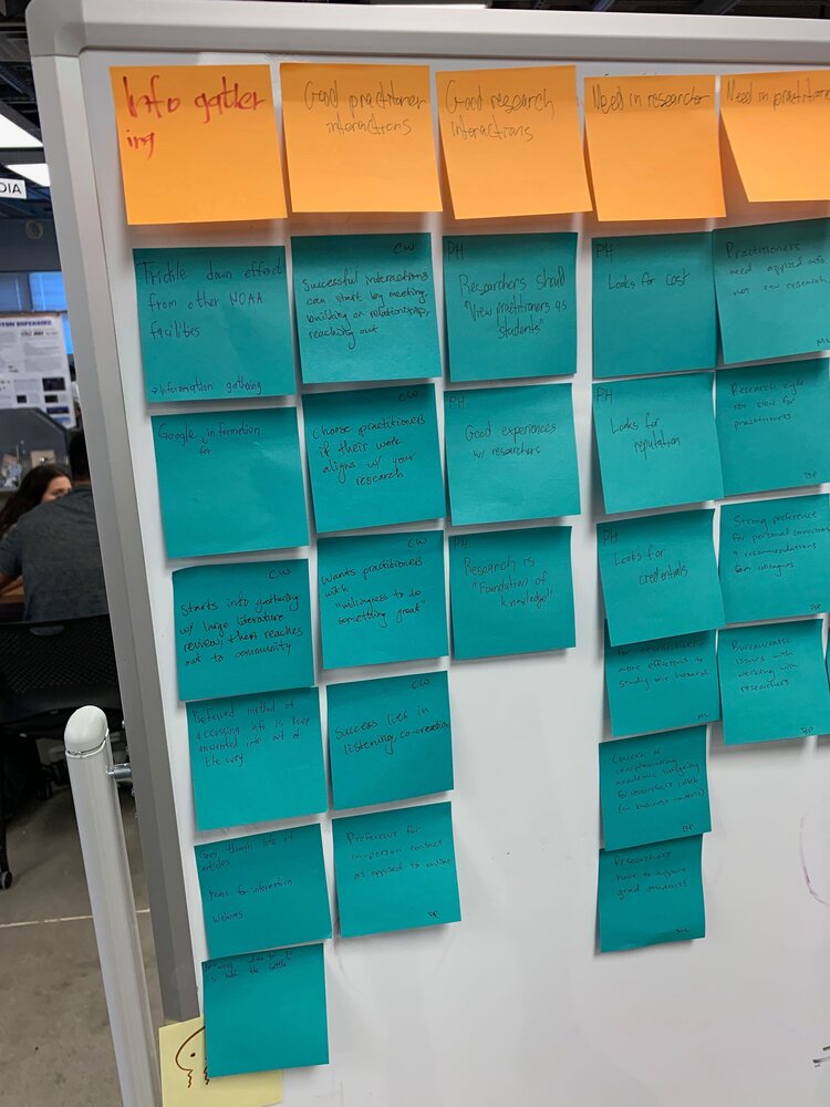 Affinity diagram of interview notes
Personas
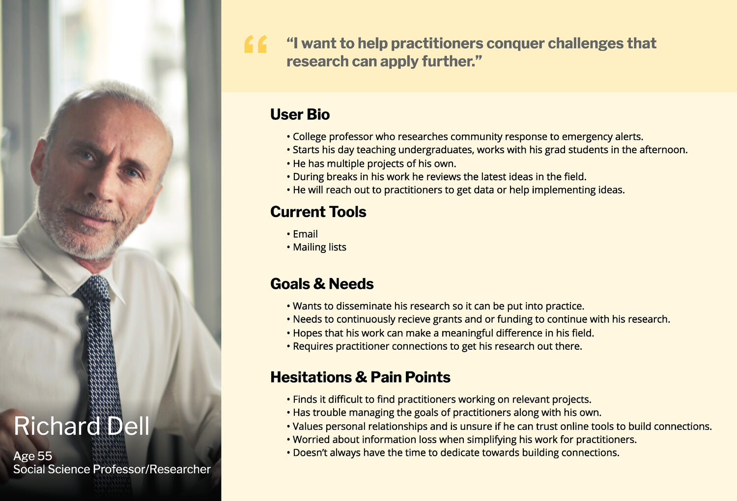
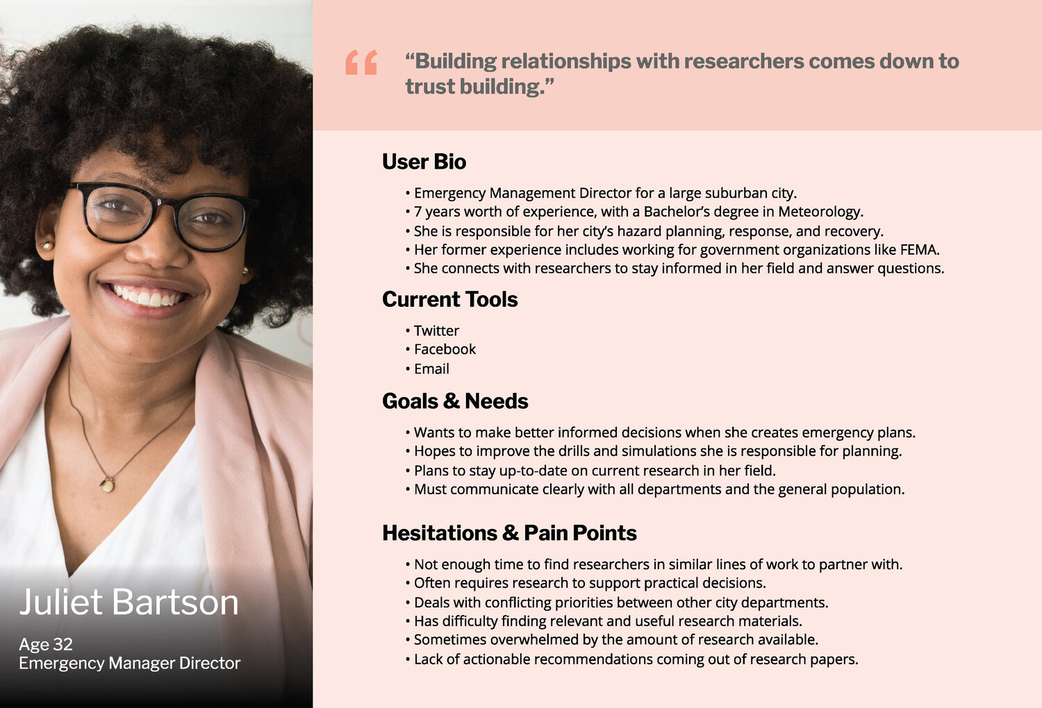
We created two personas based on our two user groups, one to represent the researchers and one for the practitioners. These personas were formed from our interview data to establish our users’ common pain points and identities, and keep us on track throughout the design process.
Ideation
With our interviews completed, we then conducted a series of three co-creation sessions with the goal of identifying users’ main priorities and forming initial sketches. These guided ideation sessions were used to form a set of design specifications, shown below, to inform the prototyping stage.
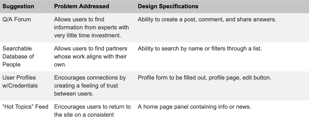 Our “high priority” design guidelines, generated from co-creation sessions
Information Architecture
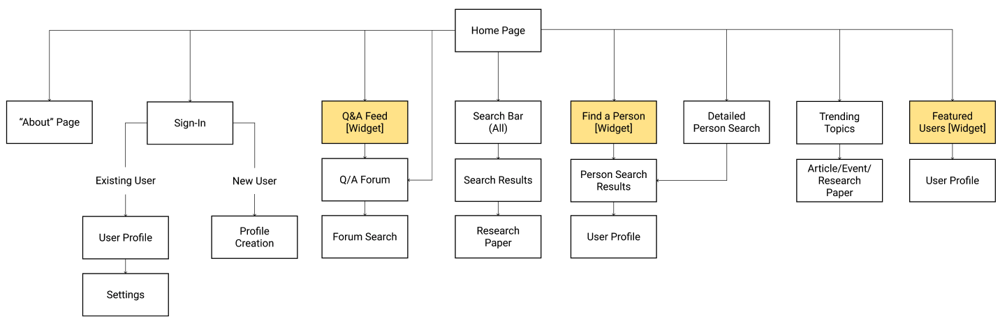
Using the design guidelines, we developed the information architecture needed to organize features and structure key user flows. We wanted to ensure that the site was organized logically, with the most important features immediately accessible.
Prototyping
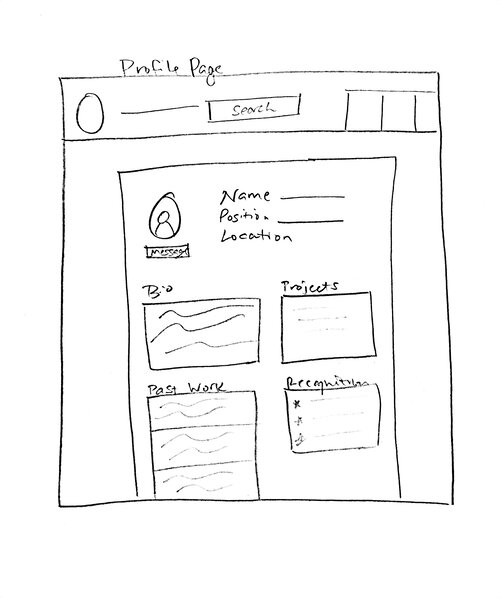
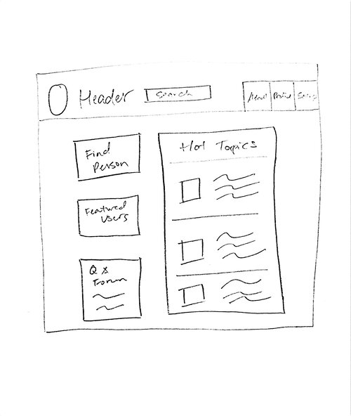
Starting with paper prototypes we created an initial set of screens that met our design requirements, eventually iterating them into wireframes using Figma.
We prototyped a home screen, “Find a Person” user flow, and Q/A forum, as these were the key aspects of the project.
Usability Testing
The final step was to assess the usability and desirability and make any necessary changes. We arranged three user tests, one in-person and two remote using Userzoom.
Each user test consisted of three tasks followed by a short interview, with notes, clicks, and time recorded for each task. The tasks were:
- Search for an answer to a specific question, then post a question to the forum if not found
- Find a person with a specific area of expertise and contact them
- Navigate to a profile page and leave a brief endorsement (imagining you recently collaborated with that user)
The results of these usability tests were overall very positive, with all participants successfully completing the tasks despite some minor confusion. The participants all commented that they would use the platform in their own work, about once a week.
Final Design
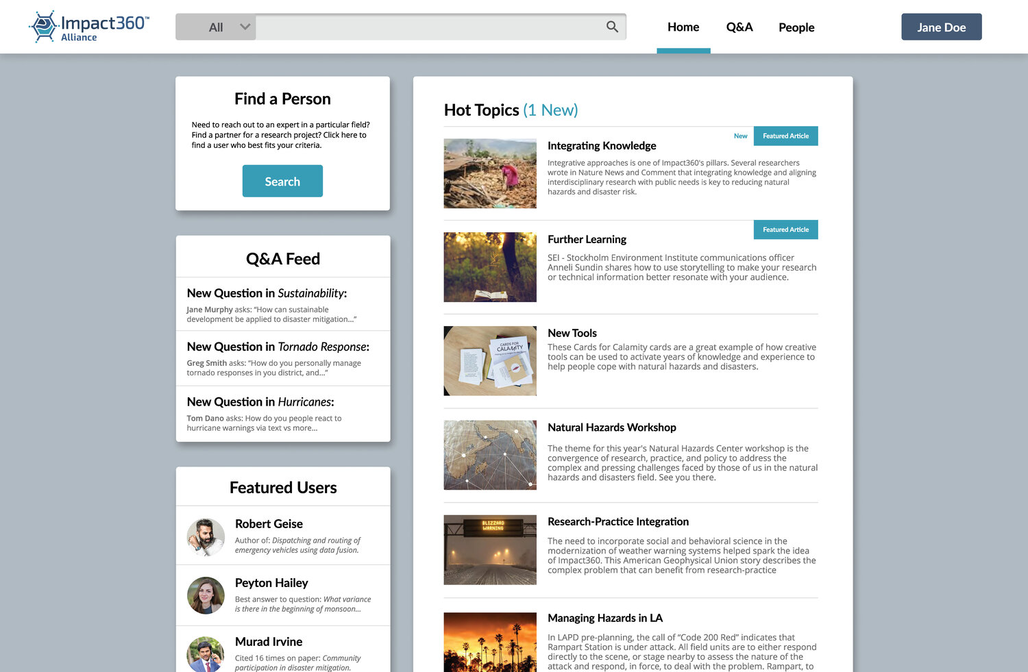 Home Page
The “Hot Topics” section provides a message board for upcoming events and relevant articles to encourage continued use of the platform and promote a sense of community.
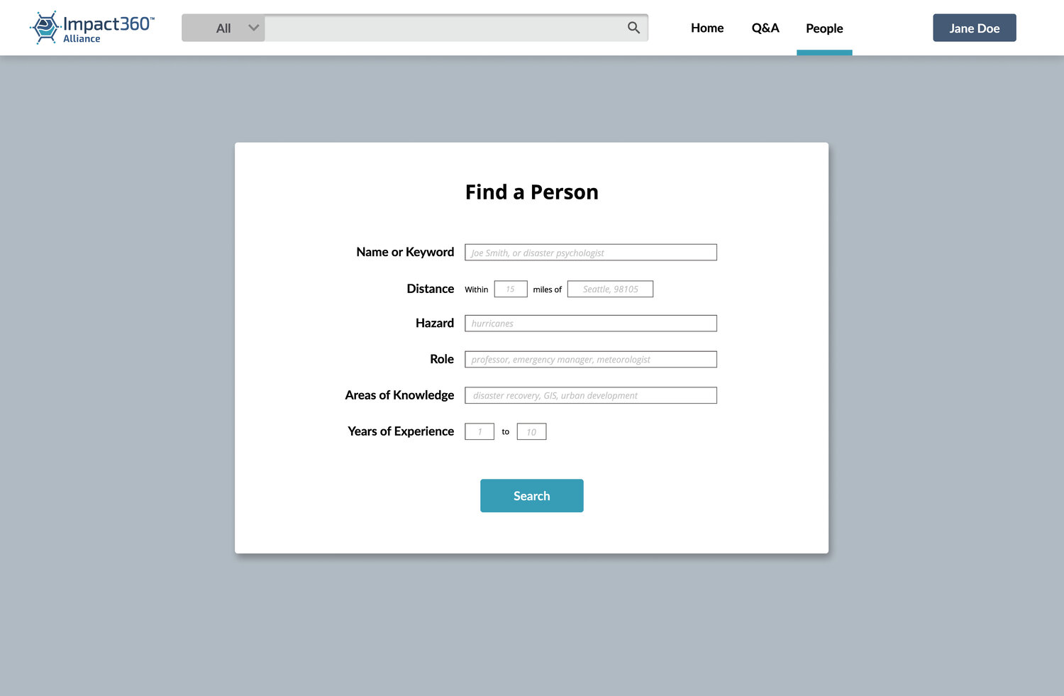
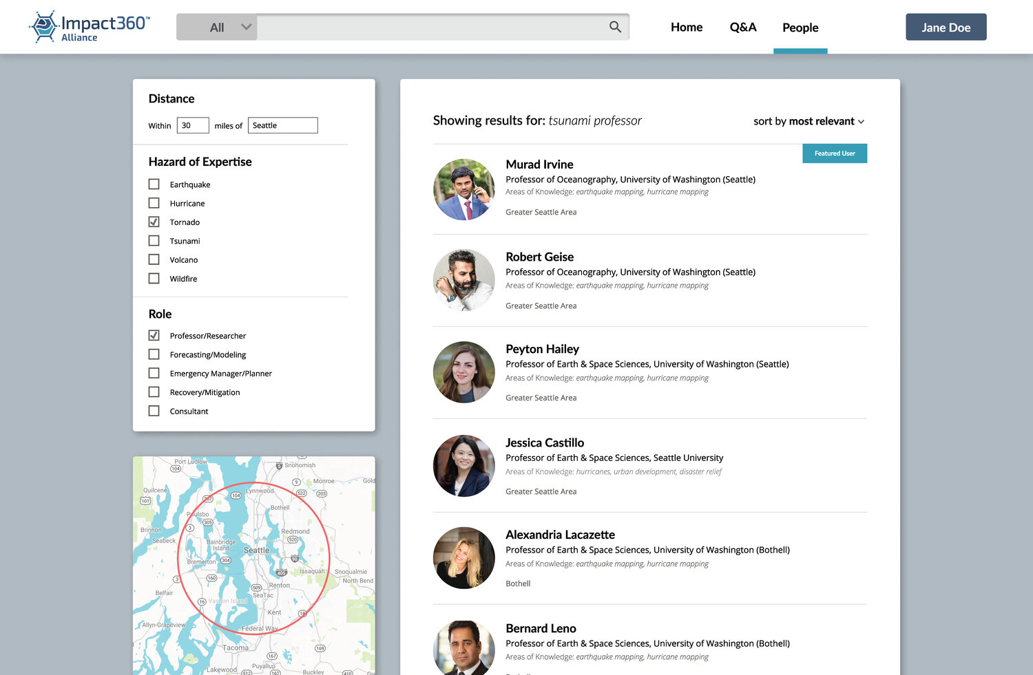
The “Find a Person” feature is designed to streamline the process of finding a collaborator or contact in a particular subfield. Having filters and location was important for users who might need to find a local expert, or someone with a specific expertise.
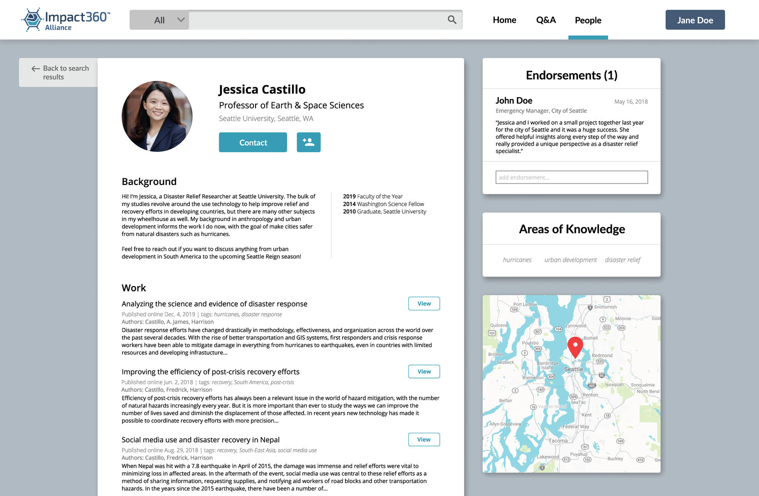
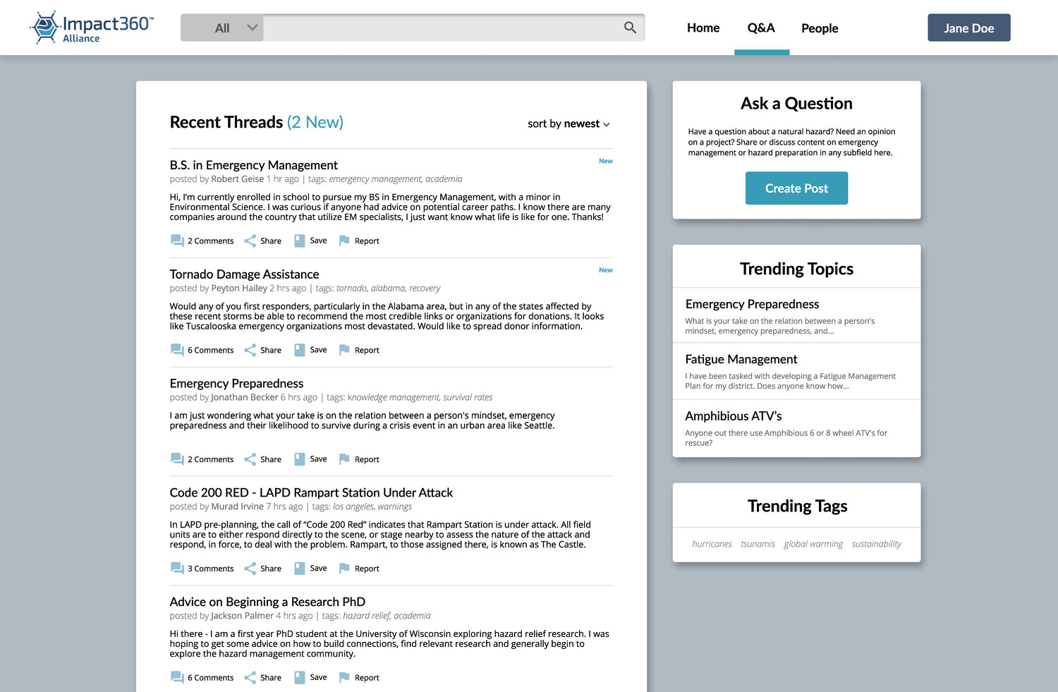
The individual profile page was designed so users could quickly verify a person’s credibility before reaching out to them, particularly with the endorsements and links to past work. The Q/A forum allows users to get their questions answered by experts, with tags for specific fields and hazards.
Further Development and Takeaways
In further development it would be useful to perform another round of usability tests with new participants given the changes made in the final product and and small initial group size. This would also provide the chance to further develop and test some of the less critical user flows such as creating a profile and creating comments in the Q/A forum.
One of the big challenges of this project was balancing the needs of our user groups, since there was such a range of age groups, backgrounds, and roles. We had to devote a lot of time to analyzing our user research and feedback data to make sure that we had a solid idea of how to design for both user groups together, rather than serving their needs separately.
