Pocket Nurse
Project Details
| Course | Other Team Members |
|---|---|
| User-Centered Design (HCDE 318) | Lily Rosencrantz, Sahana Vishwanath |
My Role
For this project, each team member shared the work equally except during the user research and storyboarding process as we each completed out own.
Purpose
The goal of this project was to design a tool to improve communication between nurses and patients in a hospital, and to subsequently enable nurses to maximize interactions with their patients and provide excellent care.
Introduction
When brainstorming user groups for this project, we wanted to pick a unique group that is often forgotten. This is the reason we decided to design a project for nurses, since they tend to be under-appreciated and underrepresented in the healthcare industry.
After interviewing multiple registered nurses, we found their main pain point to be that they are unable to interact with their patients as much as they would like to. We found this very interesting, and aimed to focus on this pain point for our project.
Pocket Nurse is a mobile application we designed that connects nurses and patients, and allows them to easily message one another. The mobile platform of this application allows for a more intimate connection to the patient, as people in general tend to have a very intimate connection to their mobile phone.
User Research
We each conducted one interview, and these interviews were necessary because we wanted to understand our users, registered nurses, better, and the pain points and desires they have. These research findings were an important first step before creating personas because we needed to first know some background about registered nurses before we could create our typical user.
Major pain points:
- Archaic computer programs that hinder the efficient flow of information
- Lack of integration of computer programs used
- Time spent doing documentation shortens nurse-patient interactions
Lily’s Research Sahana’s Research Wesley’s Research
Personas
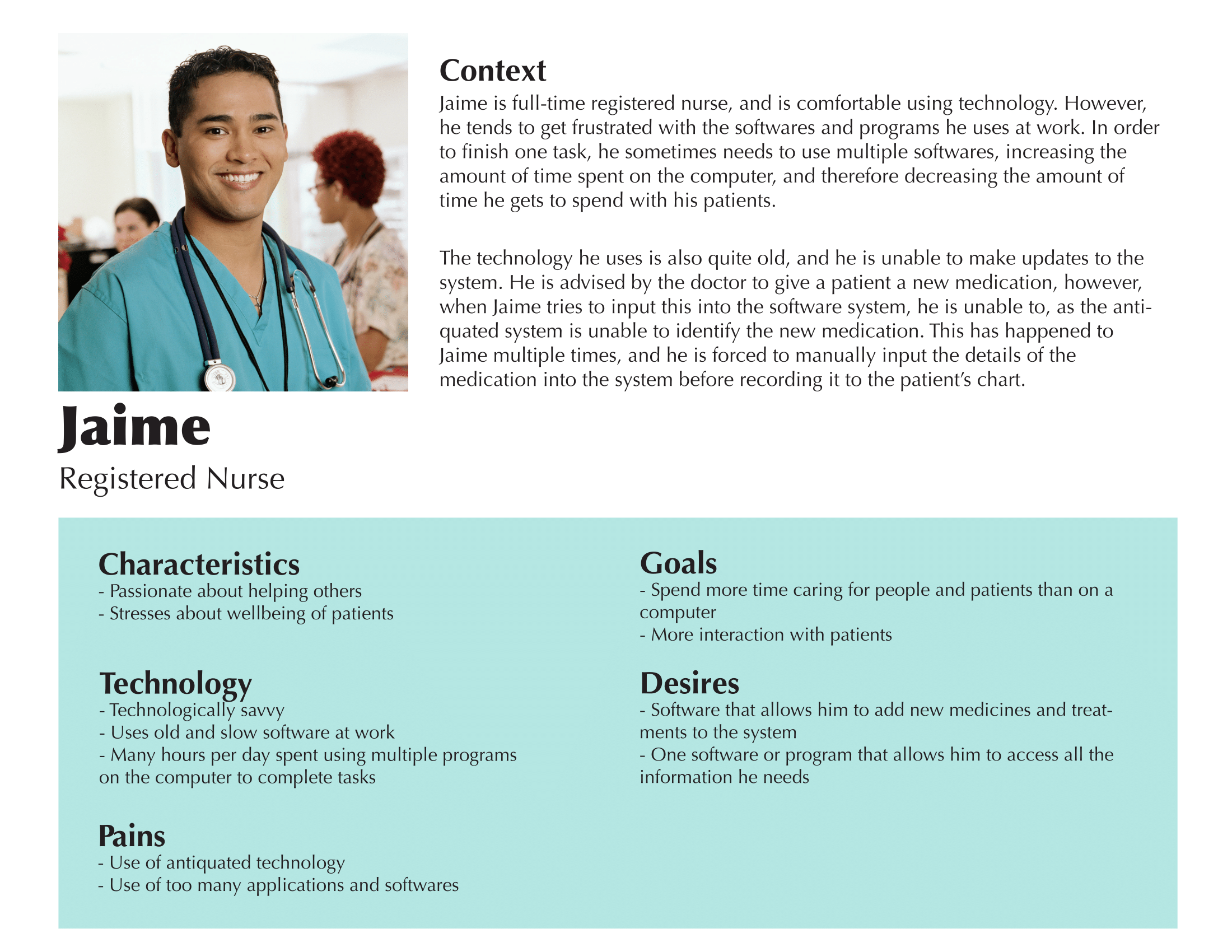
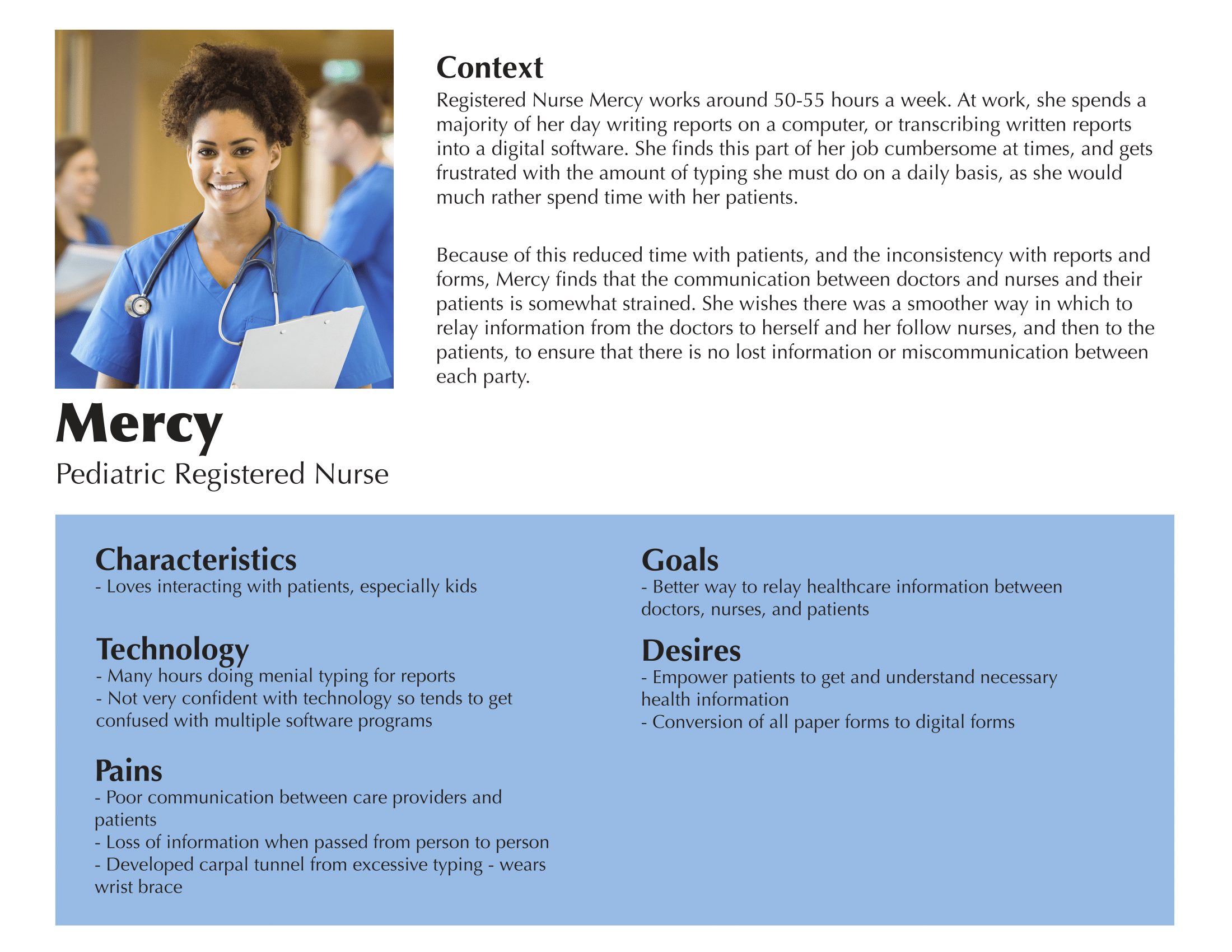
Each persona contains details such as the user’s characteristics, pain points, desires and needs with technology, as well as a short scenario describing how the pain points, desires, etc. relate to one another. We created personas to better flesh out our user group, and understand their pain points and desires. These personas were an integral step before creating the journey maps, because it was crucial to develop a scenario involving our users to incorporate into our user journey maps.
User Journey Map
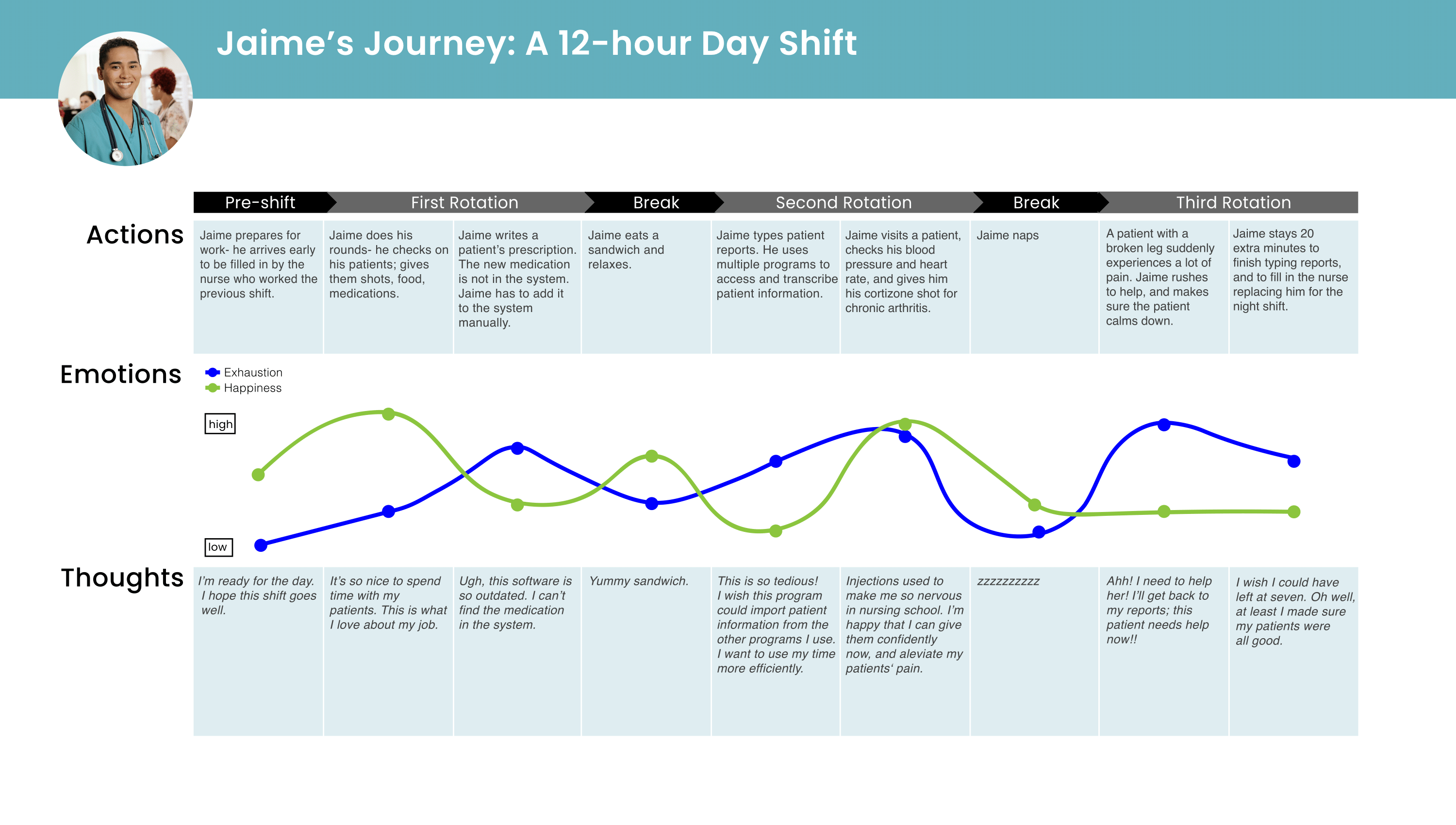
We created a user journey map to help us to understand interactions from a nurse’s point of view, and to visually represent their needs, desires, and goals. The user journey map stems from one of our polished personas, registered nurse Jaime. Jaime’s persona provided us with the idea of whose journey we were mapping, and which key points to include.
Making a user journey map required us to consider which pain points and desires would be important to map our in a scenario for our persona. In doing that, we gained a better understanding of what nurses value, and those values informed and were included in our next deliverable, the design requirements.
Design Requirements
The design requirements describe what our design should include in order to satisfy the pain points, desires, and needs of our users. This deliverable was necessary in our process because it allowed us to concretely establish the requirements that were necessary to our design.
Our design requirements are:
- Enable nurses to quickly and accurately record patient information to the electronic medical records
- Provide nurses with an easy way to access patient data
- Enable nurses to efficiently convey information to patients in a manner that they are easily able to understand
- Allow nurses to easily add information and data to pre-existing patients’ records
Storyboards
Creating storyboards was an integral part of our design process, as we were able to describe how the user would experience our design in a more specific and detailed manner. We each created two storyboards, one using photographs and the other with sketches. Using our storyboards, we were able to establish the basic structure of our design, which enabled us to complete our information architecture.
Lily’s Storyboard Sahana’s Storyboard Wesley’s Storyboard
Information Architecture
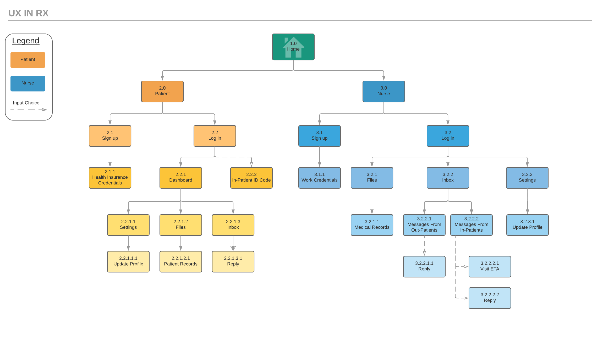
Storyboarding gave us an understanding of how our user would interact with and flow through our design on a general level. At this stage, we needed to think about the entire system and lay it out in our information architecture, or sitemap. To create this sitemap, we planned out how to break down all of the high and low level pages in our application. We utilized our design requirements to figure out the content and flow of information for both the nurse and patient side of our application.
Paper Prototype
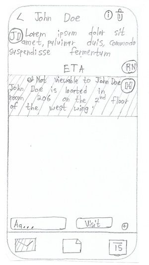
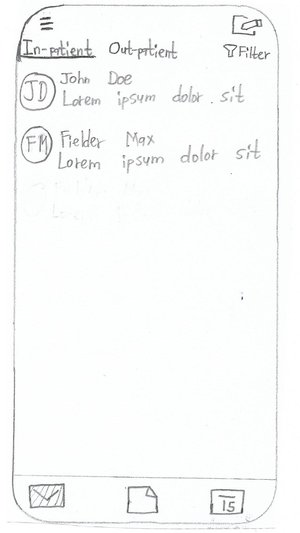
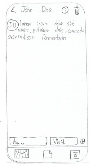
The paper prototypes built off our information architecture by adding real screens and actions to the functions we designed. We hand-drew the screens of main pathways of our app, and tested them with peers to identify interface problems. Creating paper prototypes enabled our group to put our user research into a tangible form.
After we made our paper prototypes, we evaluated them via user testing, and determined what about them needed to be changed, and what was successful.
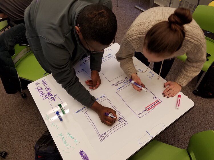 Lily and I mocking up the design of the prototype on a whiteboard.
Usability Testing
After creating our paper prototypes, we conducted a round of user testing in which we asked our users to perform specific tasks using our paper prototypes. These evaluation findings detail the notes and results of this user testing, which helped us understand any confusion in our design, or areas that are un-intuitive. These findings then enabled us to make changes to our design which we were able to incorporate into the more detailed versions of our design.
Annotated Wireframes
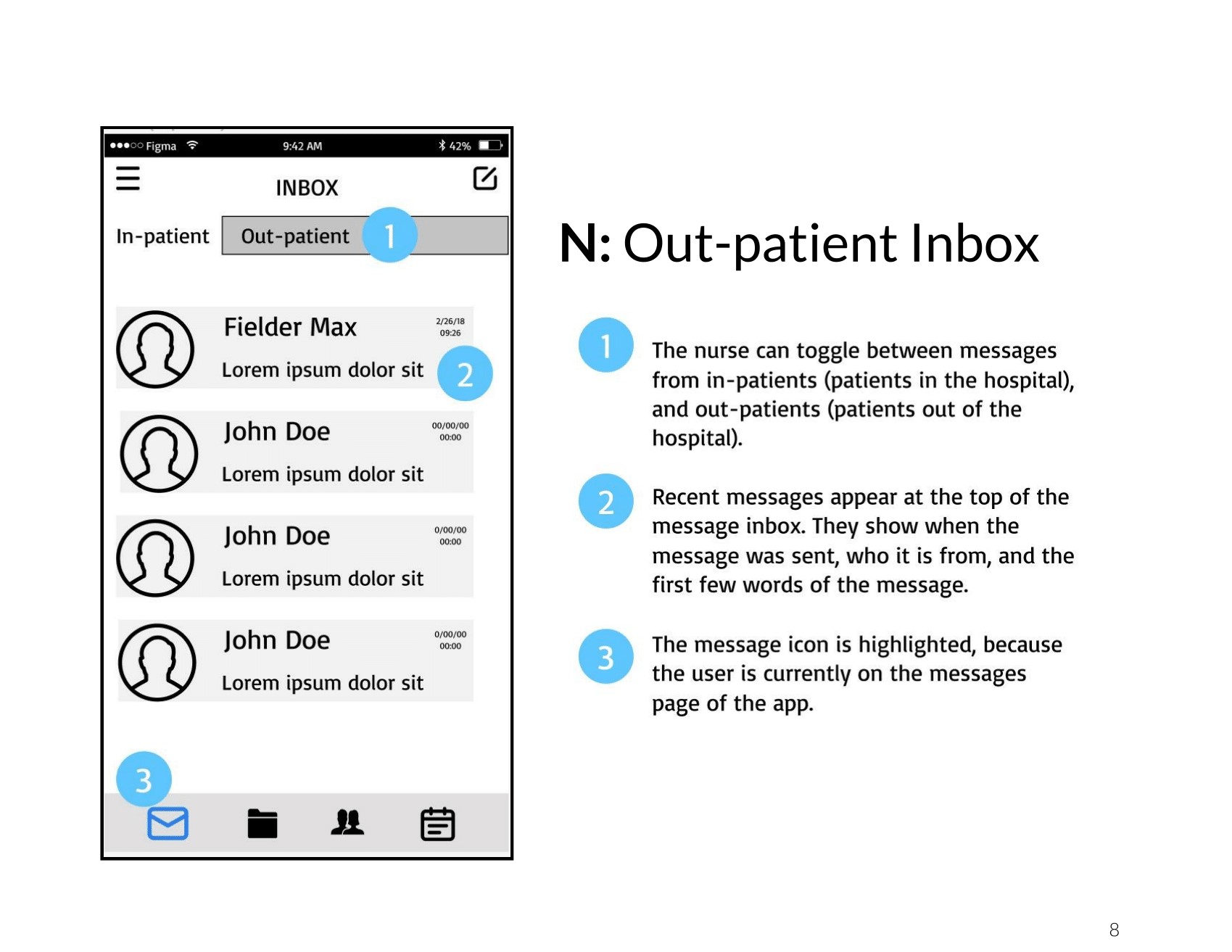
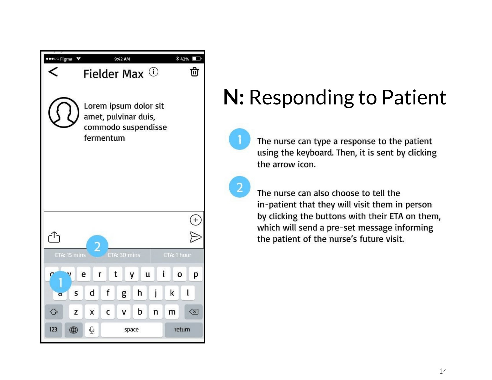
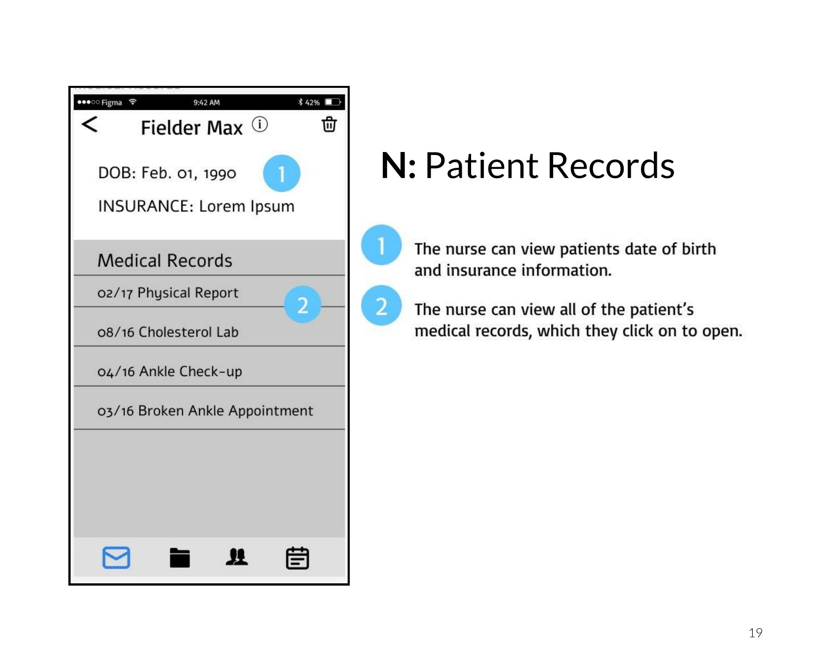
The annotated wireframes we made are low-fidelity outlines of our app that show where content goes. We made these wireframes to help us organize the architecture of content on the app, and to solidify what the layout of our app would be. Our experience evaluation of testing our paper prototypes, helped inform our choices for the wireframes: we learned which processes were not intuitive, which icons did not make sense, and what seemed important. The wireframes were a rough draft for our high fidelity mockups, and our classmates’ feedback on them informed us of the important aspects to incorporate in our next iteration.
High Fidelity Mockups
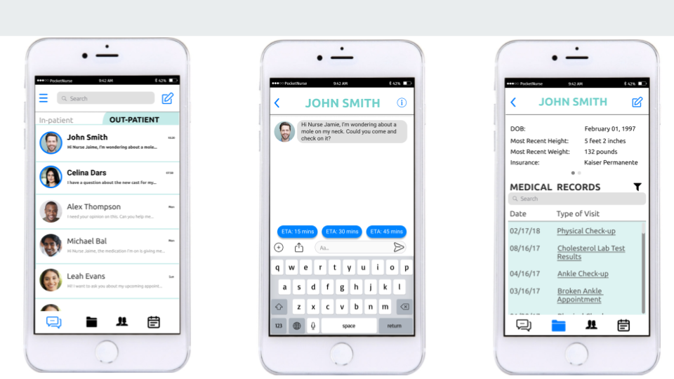
The last step in the design process was creating our high-fidelity mockups. After an in-class peer critique session, we selected a few screens from our low-fidelity wireframes to further design. With the feedback and critiques in mind, we worked to remove the placeholders as well as solidify our color scheme and layout. Creating these high-fidelity mockups helped us to convey our ideas in a more complete, professional manner and brought together all the elements we have worked so hard on for the past ten weeks.
Reflection
By doing this intensive project, during which we focused on implementing UX tactics and theories in our work, my team and I learned the importance of UX in design. I loved choosing a user group and then doing the research to deeply understand their lives, thoughts, and pains. This project opened my eyes to how fulfilling User Research is and made me realize that this is how I want to contribute to the betterment of society. UX Research is such a powerful tool for bringing about equity, respect, and empathy within my community, and the world. I see now that I am able to influence more than an application or product feature with the research I do; because truly empathizing with a person, and learning how to best help them live their best, happiest, most efficient, and fulfilled life, means that society as a whole will have the tools they need designed for them. Because of this project, I am a better designer, prepared to work with a human-centered mindset in all of my future endeavors… and I can’t wait to put these skills to use to affect positive change in the world!